#visual elements
Explore tagged Tumblr posts
Visit Tumblr Blog
Explore Tumblr blogs with no restrictions, modern design and the best experience.
Last Seen Tumblr Blogs


Fun Fact
Tumblr has been banned in Indonesia for providing people with access to pornographic content.
Quote
I hope this encourages others to watch Squid Game because the thought into visual elements was incredible.
#SquidGame
5 notes
·
View notes
Text
The Power of Visual Storytelling in Content Creation
Want your brand to stand out? 🌟 Learn how to use visual storytelling to make a lasting impact with your audience. Dive into our latest blog! #VisualStorytelling #Branding
The Power of Visual Storytelling in Content Creation Written By: that Hannah Jones Time to Read: 4 minutes The power of visual storytelling has never been more apparent in today’s digital age. Statistics show that visual content is processed 60,000 times faster than text by the human brain, and 90% of information transmitted to the brain is visual. Just think about the last viral campaign…
#audience connection#Audience Engagement#authentic imagery#brand impact#brand loyalty#brand message#brand storytelling#branding consistency#content calendar#Content Creation#content engagement#Content marketing#digital marketing#emotional connection#Hannah Jones#infographics#marketing strategy#marketing visuals#Social Media Marketing#storytelling in marketing#storytelling strategies#storytelling techniques#storytelling tips#Strategic Hannah#user-generated content#Video Marketing#visual branding#Visual Content#visual elements#visual storytelling
0 notes
Text

Iconological Analysis

Kaye Blegvad, Good Lovers Lie, 2015
Visual Elements
The specific design of Kaye Blegvad is clearly recognizable by its clean and minimalist styling, where with a few elements are actually said a lot.
This is one of her pieces, which is dedicated to Valentine's Day. It represents a kissing love couple but instead of their faces they wear a masks.
Or as Clancy Martin says in The New York Times : " VALENTINE’S DAY is not a celebration of truth telling. God forbid! Relationships last only if we don’t always say exactly what we’re thinking. We have to disguise our feelings, to feint, to smile sometimes when we want to shout. In short, we have to lie.
We all tell lies, and ...we lie particularly often when it comes to love, because we care more about love than we care about most things, and because love causes us more fear than most things do, and caring and fearing are two of the most common reasons for lying.” (Martin,C.,Good Lovers Lie, The New York Times, Feb.,7,2015, online)
The composition is well balanced and clear of any details. The focus falls on this two people who are merged in a hug and this is actually the dominant element.
The negative space around them once more emphasizes the two figures that are merged into one.
Three colours are used: white, black and pink and the use of each of them is symbolic.
There is a balance in the use of colours - none of them is dominant. The figures of the lovers are solved in the two monochrome shades: white / black. Though contrasting and antagonistic, these colours are clear and specific - everyone on their own. The pink is the relationship between the lovers and the common part between them and its choice is also not accidental: according to common beliefs this colour is a symbol of love. This colour is not used in a larger quantity than the other two but it seems to stand out and influence the observer by catching his eyes.
White is the masks and the choice of this colour also creates a certain association with the purity and innocence with which the western society usually associates this colour.
The consistency (surface, texture) here is rather hinted, and it is only intended to convey some idea of the volume of otherwise flat two-dimensional images.
In general, all the above elements:
symmetrically arranged figures in the composition that create a sense of harmony;
choosing the three colours that interact very well combined with a clear concept, create a very pleasant final impression of the overall harmony and completeness of this illustration.
0 notes
Text
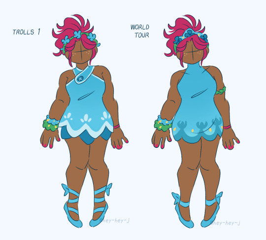


this started as me just wanting to do a side-by-side of her two holiday outfits and it quickly spiraled from there lol
(★ my Kofi)
#my art#dreamworks trolls#trolls fanart#trolls poppy#trolls#anyway uhhhh i got a couple notes for some of these#i thought it would be neat if a few elements from her 2 Many Hits outfit reflected in her World Tour Climax outfit#Pop Explosion (negative) vs. Pop Explosion (positive)#the belt she wears in Band Together is also a carry-over from that World Tour Climax outfit. yadda yadda visual character development.#she can have as many bracelets as she wants on her right wrist but her hug time bracelet is the ONLY one she wears on her left wrist#anyway my favourites are Band Together and Trolls Holiday 😊
530 notes
·
View notes
Text
I actually love how ugly Merlin's outfit is in Merlin. BEFORE YOU YELL AT ME - I love his outfit, I think it's fun, but when you look at every other character, even other peasants, he literally is wearing ill fitting rags. Everything is too big on him (despite being like six foot but whatever) and his silhouette reeks of boring character design.
But like!! Yeah!! He is just Some Guy. I love how they never give him som epic mage robes or a cool outfit for more than thirty seconds. He is unassuming. He's over here, commanding dragons and controlling the weather in the medieval equivalent of stained sweatpants and a night shirt. It's great.
#mine#merlin#bbc merlin#i came to the realization#that his outfit is quite lame#because whenever i try to find cool edits of Merlin#the coolest looking ones are the ones with the least anount of Merlin in them lol#visually#he is a wreck#like the knights get cool armor and capes#the girls all get like forty gorgeous outfits#the other magic users get fun robes#the other peasants wear a lot less layers#which makes their character design make a bit more sense#and it gives a good silhouette of the baggy clothes and the arms sticking out#and the grime on their face#Merlin is just like hello it is me I have a jacket#the sickest thing about this guys drip is his scarf and his socks#like it's no wonder more cartoony style fan artists tend to change an element or two of his outfit#i love him#but he looks lame#i think he looks wonderful but we are all BIASED#WE ALREADY LOVE THIS GUY
640 notes
·
View notes
Text
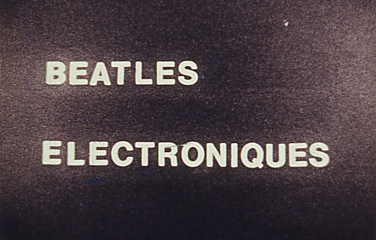


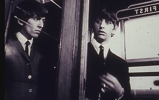
beatles electroniques (1969), dir. jud yalkut & nam june paik [watch]
"BEATLES ELECTRONIQUES was shot in black-and-white from live broadcasts of the Beatles while Paik electromagnetically improvised distortions on the receiver, and also from videotaped material produced during a series of experiments with filming off the monitor of a Sony videotape recorder. The film is three minutes long and is accompanied by an electronic soundtrack by composer Ken Werner, called 'Four Loops,' derived from four electronically altered loops of Beatles sound material. The result is an eerie portrait of the Beatles not as pop stars but rather as entities that exist solely in the world of electronic media." — gene youngblood
#the beatles#nam june paik#jud yalkut#the collaboration U never saw coming#the sound element is arguably a lot more interesting than the visual it's kinda funky#op
211 notes
·
View notes
Text
i’m hiding in the passepartout!
#(voice of a guy who has so much shit to do) Hmmrgh. animatiec#song is focal point by louie zong pls go give it a listen it is a BANGER and the visuals are so fucking good#literally inspired me on a whim#myart#myanimatics#oc: wade#finally … after 2 years …. a wade-centric animatic ???!?!?#or well. as wade-centric as it gets .#oc: no way back#oc: needless separation#oc: ten elements through finite waves#had lots of fun with the coloring on this one#lasso tool animatics could be the new move#tumblr made it such ass quality oh well... maybe i'll upload it to youtube if i can be fucked
139 notes
·
View notes
Text
The problem is Pixar movies used to have distinct aesthetics. This one's about cars! That one's in the ocean! This is a trash compactor robot in space! Now every single Pixar movie is set in a primary colored fantasy/sci-fi world with anthropomorphic blob creatures that are probably blue. Why would I want to go watch yet another of those.
#inside out? check. soul? check. the one with the element people? check. the new one i saw a poster of at the movie theater? check#where's your creative artistry?#do you want to make unique visual experiences or be a cartoon schlock factory?
101 notes
·
View notes
Text
Controversial opinion: Vox's design sucks
...
Because he should be wearing a NORMAL TIE. not a BOWTIE. It would:
Add to his businessman persona
Give a place for that wifi symbol to go that isn't awkward
Be a good opposing design to Alastor's bowtie
Potentially give the idea he's moved away (or attempting to) from Alastor. Especially if they had it that Vox USED to wear a bowtie.
Also, we joke about it but seriously, why does everyone have a bowtie when it doesn't make sense for some characters like Husk--
I rest my case your honors.
...
Rebuttle:
Vox having the bowtie could signify him latching onto his past with Alastor and not being able to move on
#DAMMIT. FOILED BY MYSELF ONCE AGAIN#Oh don't mind me just having a two way debate with myself#We all know the bowtie was just cuz Viv happens to like that on her characters#which we all have a sort of favorite go to design element so can't blame her#(even if on a professional level maybe that shouldn't be the case but I digress. She's fair to live her bowtie dreams)#But think of the SYMBOLISM that isn't actually there#Which fair. This is 100% one of those things fans might look more into than the creator and the creator is justified not thinking it#Bowties are deep and complex now#Vox like a cat or dog not wanting to get clothes put on them when Velvette tries to put him in a normal ass tie is a fun visual at least#Vel: “Vox if you want a more professional look you need to get rid of the bowtie.”#Vox: “No. I refuse. I must prove I wear a bowtie better than Alastor.”#celtrist#cel rambles#hazbin hotel#hellaverse#hazbin hotel design#hazbin hotel critique#hazbin vox#hazbin hotel vox#vox the tv demon
155 notes
·
View notes
Text


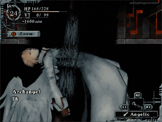

Baroque (2008) - dev. Sting Entertainment
#baroque#baroque ps2#baroque spoilers#gamingedit#gamediting#baroque archangel#been playing the ps2 version!#visually not as cool which is a bummer but I appreciate the different perspective#the first person is better but anyway#I appreciate the extra nuggets of new information though#but consciousness orbs????#sense spheres is SO much better!!#too many ui elements just clog up the screen too!#my vt was shot again so that made me laugh when I was recording this lol#I actually had a nutritive in my items but since I was at the end anyway I didn't use it#I might get the true ending first on the ps2 version at this rate lol
173 notes
·
View notes
Text
people love to say that the show got bad in later seasons but the show was very obviously extremely bad from the get-go and very clearly being made by people with no real investment in the books
#they didn't even carry over the bare minimum aesthetics of the books#let alone some of these aesthetics being key/core plot elements#they didn't even do the VISUALS#how could you expect them to get to the meat of the story
104 notes
·
View notes
Text
Something something about the chess metaphor and Chris being used as a pawn in Helena and Ramons game.
How ballroom dancing is a bit like a game of chess and Eddie was the pawn in that game.
Both chess and ballroom dancing have clearly defined moves and sequences and patterns and there isn’t much room for ‘going rogue’.
Something something about trophies representing compliance in their game and giving them control over everything
#I’m not sure where exactly im going with this but there’s something about both chess and ballroom#both having a cat and mouse element to them#and both require you to be thinking several moves ahead.#something about Helena and Ramon being played at their own game by Eddie and Chris#and something about chess and ballroom both being visual/physical representations of internal battles#I can’t quite get what is in my brain to translate into words#if I do I’ll come back to this#911 spoilers#911 abc#eddie diaz#Christopher Diaz#Helena diaz Ramon Diaz
74 notes
·
View notes
Text


post-pareidolia arvo house - it is situated on the outskirts of sartrill, and is a more crakam-style house, with some accomodations for his human form. the actual ladder down is on the other side of the trunk. the pines that support crakam houses are not the average pinus sylvestris but rather another pine relative, 'ramnfura', which is cultivated especially by harpies as they grow to impressive heights and are very robust.
#oc stuff#pareidolia tag#oc: arvo#fantasy#visual development#i guess HAHA#Me when i keep drawing post-pareidolia bullshitttt#well tbh i did want to draw this to kind of figure out sartrillan architecture more....#im thinking that basilisk buildings are like very nestlike. magpie nestlike and also huge#with some housey elements... i have to figure it out#also yes arvo is left handed
147 notes
·
View notes
Text

draft header for an html blog project 🌟
#this is fine to borrow btw! you can use this as your header#i want to make a more detailed one (still pixelated) that includes the blog title somehow#the end goal is something hypnospaceoutlawesque w lots of colors and chunky visual elements#struggling to land on a title also - this project might not pan out but it’s a lifelong goal i think#doccywhomst art tag#hypnospace outlaw#neocities
196 notes
·
View notes
Text
The creative fulfillment of actually being able to draw my fixation during work hours without guilt ... I used to cram bg3 into evenings a lot. (Now I'm cramming ocs into work hours And evenings //shot)
#(patreon is my job)#i love ocs#each time i get big into them i do a better job#these ones are the most alive to me haha#like the first few ocs were just visually appealing with some trope elements but they werent real u know.#da adopt community was not good for that lmao heres my beautiful unique design! yeah idk who they are either...
70 notes
·
View notes